Codex Progress Bar Card
KPIMulti-row progress bars with automatic colour thresholds — green, amber, red.
Overview
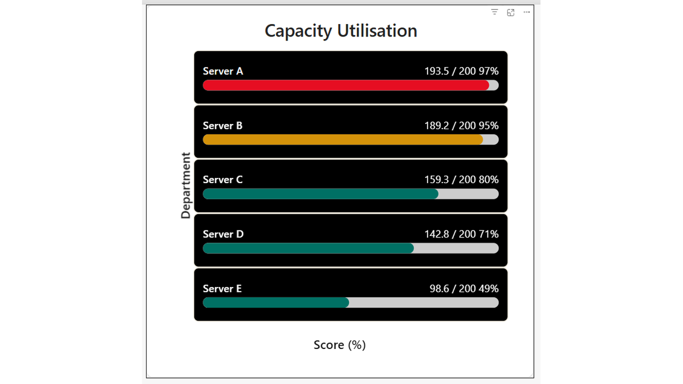
How full is full? See it instantly across every row. Codex Progress Bar Card renders one horizontal progress bar per category, showing current value as a proportion of a maximum. Configurable warning and danger thresholds automatically change the bar colour — so rows approaching the limit stand out.
Ideal For
- Capacity monitoring — storage, headcount, or budget consumed vs limit
- Task or goal completion — progress toward a target for each team or project
- Weight or volume utilisation — load factor per vehicle, bin, or route
- Any per-row metric where 'how far to the limit' is the key question
Key Features
- One bar per category row — as many rows as your data has
- Automatic colour thresholds — configurable warning % and danger % in Format pane
- Colour transitions: green to amber to red as utilisation climbs
- Value label showing current, max, and percentage for each row
- Sort order field well — order rows by utilisation, name, or any measure
- Track (background) colour configurable separately from bar colour
- Hover tooltip showing category, current value, max, and progress %
- Click a row to cross-filter other visuals on the page
Pro Tip
Set Warning at 92% and Danger at 95% to give yourself a visible amber band before the red zone kicks in.
$1.99
/ user / month
Billed through Microsoft AppSource
Category
KPI
Tooltips
Cross-filtering
High Contrast