Codex Now vs Then
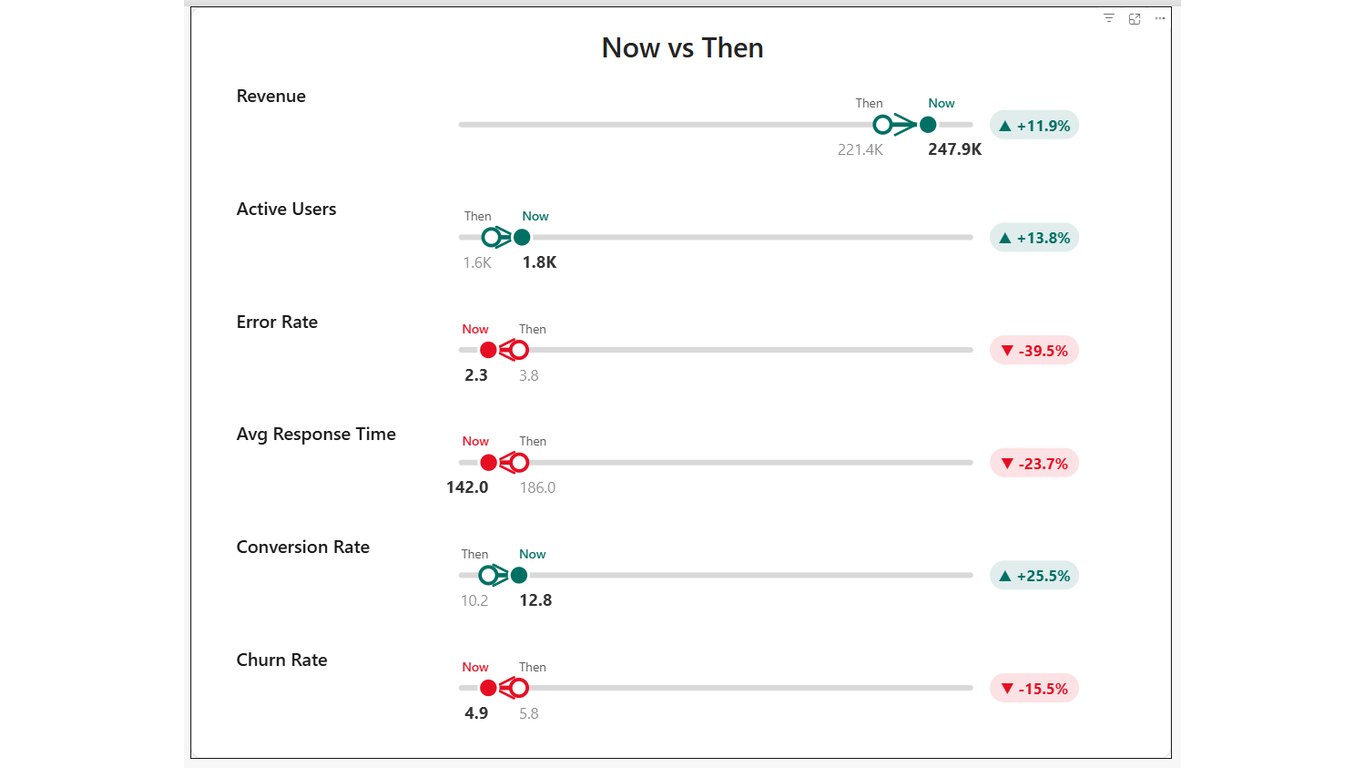
ChartAn animated dumbbell chart — compare current vs baseline with variance badges.
Overview
See the shift. Feel the impact. Codex Now vs Then renders a dumbbell chart — one dot for the baseline, one for current — connected by a line that shows direction and magnitude. Variance badges on the right show improvement or regression, colour-coded by direction.
Ideal For
- Before/after reporting — pre- and post-initiative performance
- Period comparisons — this month vs last month, this year vs last year
- Go-live dashboards — post-implementation metrics vs pre-implementation baseline
- Executive presentations where you need to show movement, not just a number
Key Features
- Dumbbell connector from 'Then' dot to 'Now' dot with animated reveal
- Colour-coded variance badge — green for improvement, red for regression
- Direction awareness — configure 'upIsGood' or 'downIsGood' per metric
- Format hint per metric — currency, percentage, or number formatting
- Sort order field well — arrange metrics in any meaningful sequence
- Staggered entrance animation — metrics animate in sequence (~200ms delay)
- Hover tooltip showing metric name, Now value, Then value, and variance
- Click a row to cross-filter other visuals on the page
Pro Tip
Set Direction to 'downIsGood' for metrics like cost, error rate, or response time so the variance badge correctly colours a decrease as green.
$1.99
/ user / month
Billed through Microsoft AppSource
Category
Chart
Tooltips
Cross-filtering
High Contrast