Codex Bullet Chart
ChartCompare actual performance against a target — in less space than a bar chart.
Overview
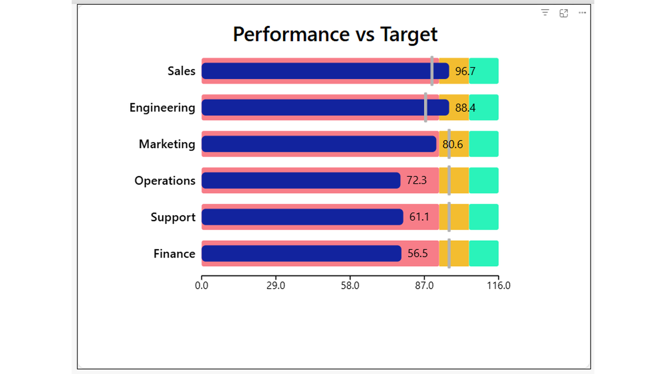
More signal. Less space. No clutter. Codex Bullet Chart is a horizontal bar chart optimised for performance-vs-target reporting. Each row shows an actual bar and a target marker line, making it immediately obvious who is above or below target — without needing a separate chart or conditional formatting column.
Ideal For
- Department or team performance dashboards
- Sales pipeline — deals closed vs target by rep or region
- Operational KPIs — cycle time, quality score, or throughput vs target
- Any scenario where you have an actual value and a benchmark to compare against
Key Features
- Horizontal bar per category with configurable bar colour
- Target marker line with configurable colour and thickness
- Qualitative range zones (Poor / Acceptable / Good) for background context
- Value labels on bars — show actuals directly without a separate tooltip
- Sort order field well — order rows by any measure, not just alphabetically
- Axis labels with configurable title and gridlines
- Hover tooltip showing category, actual, and target
- Click a bar to cross-filter other visuals on the page
Pro Tip
Set the Poor and Acceptable thresholds in the Format pane to match your business benchmarks. The background zones give reviewers immediate context without adding extra visual elements.
$1.99
/ user / month
Billed through Microsoft AppSource
Category
Chart
Tooltips
Cross-filtering
High Contrast