Codex KPI Card
KPIA sleek, branded KPI card with dynamic accent colours and change indicators.
Overview
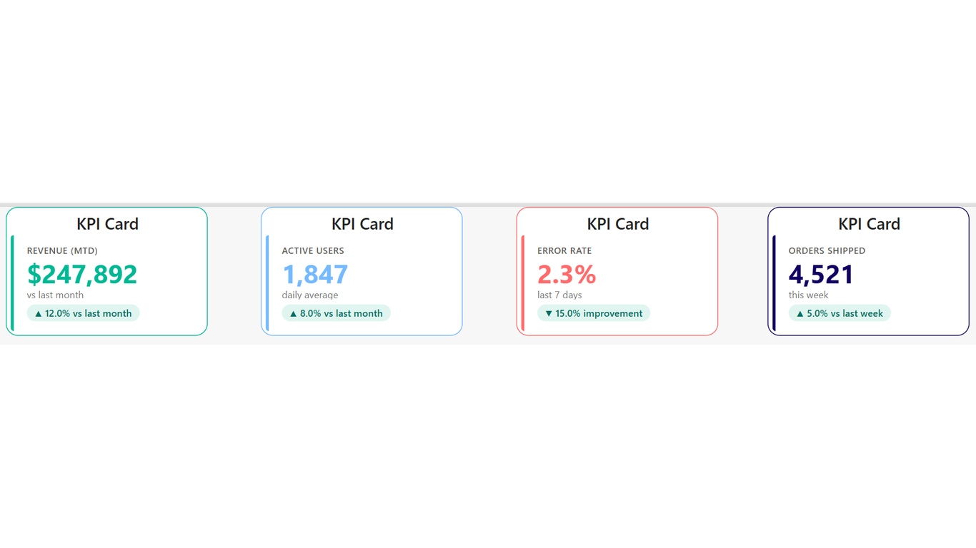
Your metrics deserve better than the default card. Codex KPI Card replaces Power BI's built-in card visual with a purpose-built KPI tile that communicates status at a glance. Show a value, a subtitle, a change pill, and a colour-coded border — all driven by your data, not hardcoded formatting.
Ideal For
- Executive dashboards where every pixel counts
- Multi-metric pages with consistent card styling across 4–36 KPIs
- Operational monitoring where green/amber/red status must be immediately obvious
- Report templates that need to match corporate brand guidelines exactly
Key Features
- Dynamic accent colour driven by a measure — colour each card independently based on data status
- Change pill with directional arrow — configurable as upIsGood, downIsGood, or neutral
- Subtitle line for context (e.g. 'vs last week', 'YTD', 'estimated cost')
- Text colour driven by a measure — value text changes colour with the accent
- Hover tooltip showing measure name, value, and variance
- Click to cross-filter other visuals on the page
- Clean, minimal design — no chart junk, no unnecessary chrome
Pro Tip
Use one CardConfig table with a CardID filter per visual instance. This lets all 4–36 cards share the same 6 measures, controlled entirely by your data.
$1.99
/ user / month
Billed through Microsoft AppSource
Category
KPI
Tooltips
Cross-filtering
High Contrast